

MAZDA CONNECT
CUSTOMER PORTAL
The mobile optimized owner's portal dedicated to delivering the best ownership experience for driving your Mazda vehicle.

Project Year
2018 - present
Project Client
Bermaz Motor Trading Sdn Bhd
Category
PWA, UX & UI, Customer Experience
Product
Overview
In 2018, I was part of an ambitious project to improve the current Mazda customer journey experience by creating a PWA portal as a one-stop platform that runs on mobile phones. The portal acts as a supporting tool to provide the best customer digital experience to Malaysia market consumers – from knowing a car, to buying a car, and owning the car.
Terms & Conditions: The content, information, and materials published on this platform such as case study, feed, post, listing, text, image, photo, video, audio, visual, illustration, graphic, or transmitted in any form of display or advertising, are solely based on our self-study, self-learning, self-opinion, self-practical experience, and does not necessarily reflect the views of Mazda or third-party resources.
Table of Contents
Issue
The current process of buying a car is still very manual. In this modern age, most of us rely on the internet to search for the information we need. And yet, there are still gaps in between to get the right car – dealing with sales personnel, long tedious manual handling process, and waiting for the new car arrival without real-time updates. After one has gotten the right car, the gaps continue – communication & engagement of the sales personnel became lesser and eventually out of touch. The loyalty value of the vehicle owner slowly fades away.
Today, the automotive industry has begun to rethink its business model, further into the digital age of retailing out of necessity, especially in this COVID-19 pandemic. Activities like car online shopping & keep in touch with sales personnel from our own devices at home are the new norm. It doesn't mean that physical showrooms need to be struck off completely. Spending RM200,000 on a product is a significant purchase, it's a necessity to touch and feel the “awesomeness” first before deciding to sign the deal. Taking the 'Customer Experience Journey' to the next level is gold. Customers appreciate a buying process that reflects how they want to shop. The question is:
How does a good user experience help to make the customer journey experience more fun and personalized?


Image Source: Car Buyer Labs, The Detroit Bureau
My Role
I led the UX & UI design for this project from the start to the present – responsible for the concept, style guide, user research, user journey maps, wireframing, prototyping, content writing, testing, training the users, and customer experience. I have worked alongside a team of back-end developers and a Senior Manager to oversee the development of this portal.
The Mazda Connect Customer Portal version 1.0 was launched in Beta in November 2018 and officially in Jan 2019.
We facelifted the whole portal to version 2.0 and was launched on Feb 2021, with new layout and features. I am still involved in the continuous enhancements of this portal. We will continue to improve the portal through useful feedbacks from both internal and external users.
Research

Source: Dealer Refresh, 26 Feb 2018
Based on much research, we came up with a hypothesis:
52%
-
Customers do NOT know where to find the product info they need – price, specs, colors, and features.
73%
-
Customers prefer the ease of buying the right car without spending much time on the manual handling process.
-
Lack of product info is displayed from the website and for the sake of convenience, customers depend on middlemen or agents for assistance.
81%
-
Customers do research online before finding the right car.
-
Customers get turned off by aggressive sales personnel who do not fulfill their needs. This is due to the sales personnel may not know the new customer’s preference and lifestyle beforehand.
I visited a few other dealers to prove the hypothesis right:
-
I pretend to be a customer and my mission is to buy my dream car (I did some research on that specific brand earlier before I went).
-
I questioned the sales personnel on the product, compared with other models & brands, price & specs. I got a long explanation from the sales personnel – which is too much info for me to absorb, probably to be forgotten after I leave the building lol.
-
I try to look for other interactive touchpoints like kiosks or something that amuses me, instead of depending on the sales personnel for more info. Some dealers have a simple TV display or standalone kiosk to show the product info, depending on the showroom size.
In conclusion, the way of selling cars is still quite manual in Malaysia. As expected, most of the sales personnel present the product info manually to the customers. It was not interactive or fun learning about the specs and price comparison by listening to words verbally. The hardcopy brochure giveaway still exists. After taking the brochures back home, I would have forgotten where I put it the next day when I needed the info again – not eco-friendly and practical.
I’ve conducted few short interviews with customers, friends, and colleagues for their opinions on:
[Me] Q: How do you prefer to buy a car?
[Adeline, age 40+] A: I prefer to take my own comfort time to explore all the models by myself, starting from the website all down to the detailed specs and prices, but not necessarily asking, “do I want model A or model B?”. It will be more like, “what is your lifestyle or personality?” The website will then recommend a set of models based on your selected options. It’s more like a personalized service catered for every individual since all of us have different preferences.
[Me] Q: What can be improved on the car purchase experience?
[Ahmad, age 30+] A: I hope the car buying process can be fun and special. Like the salesperson knows what I’m really looking for without explaining the other models which I’m not interested in. I hope they have Google Analytics superpowers even before I visit the showroom! They’ll be greeting and put me straight to the test drive of the model that I want.
[Me] Q: Which area do you think is important when it comes to buying the right car?
[Shalini, age 20+] A: In this 21st century, the younger generation like me rely on the internet for everything, including buying houses and cars. Most of the car brands’ website limits the display info to only models and features. I wish they can be more transparent in putting more detailed info like actual prices, reviews, and ratings – the common sections you see in forums and shopping sites. I think through reviews and ratings, give us (the consumers) more confidence in your brand, like “why should we buy this model from you?”.

Source: FutureLab, 2019
Objective
The Connectivity of a One-stop Platform
The goal of this project is to create a platform as a supporting tool to provide the best customer digital experience to Malaysian market consumers – from knowing a car, to buying a car, and owning the car.

Target Audience

The platform was developed to be used by everyone – the non-vehicle owner & vehicle owner. From the 2 main user groups, we grouped them into 3 categories – Hot, Warm and Cold.

Image Source: Know Your Meme, Meme Generator, The Conversation, Conduit Consulting
Project Kick-off
The Process
Based on the objective and goal, I’ve laid down a set of UX Principles to guide us through:


01
Usability Research
-
PWA (Progressive Web Application) instead of Native App
Progressive Web Apps is a website that looks and behaves like a native mobile app. PWAs are not downloaded and installed, though they can be pinned, and operate within browsers. Mazda Connect Customer Portal is a PWA.
Due to advanced technology, mobile phone users continue to grow and evolve, people are spending more time on mobile devices to access the internet. All of this means one thing, businesses need to be where their users are and the users are definitely on their smartphones. This trend is not dying any soon and adopting a mobile-first strategy has become indispensable for every business across industries. For more info on PWA, click here.
-
Competitive and Comparative
I did a lot of comparisons from different apps of various genres. There are currently many automotive & car-related apps with similar functions & features out there – my car dashboard, garage, check your car status, book a service appt, car models configurator, etc. The question is:
How connected is the portal between the customers with the internal operation key users?

A platform will remain a redundant platform (regardless of an app or PWA) if there is no proper engagement from the internal key users that solve the actual issue of the customers. There's no doubt the necessity for customer helpdesk or support service is still required to manage the fronting inquiry. It's more than just replying "Thanks for your inquiry, we will get back to you soon" and more to what happens next – escalate the issue or inquiry to the next PIC to resolve the issue. Does the PIC know about this? Meanwhile, does the customer knows that the PIC is investigating/solving the issue? Is there a real-time status or notification sent to the customer & PIC? and so on..
-
Mazda CI, branding, art direction, UI, UX, contents
I did a lot of research from other Mazda global websites – USA, Australia, UK, Japan, and Canada. Mazda has had an established visual identity for many years. As part of the standardization guidelines across global countries, we stick to using the provided CI from Mazda Japan – theme, color, font, typeface.
-
UI, UX, design elements, contents
I researched other resources to fit the “standard norm” in mobile-optimized design – Material.io, Pinterest, Behance, Dribbble, e-wallet apps. Instead of reinventing the wheels, I get ideas & inspirations from existing apps & fine-tune the rest.
-
Experiments with different layouts – hand sketching, card sorting, wireframe, flowchart
I did experiments & trials from the researched resources to come up with the best and user-friendly layouts.
02
Design principles, concept & art direction
Information Architecture – Form Follows Function
My initial challenge was to propose how to display content for the owner/driver to browse the common things that they look for in owning or buying a car. Based on my research & interview results from the users earlier, I listed out & sketched as many contents as possible without grouping them into categories first. The contents included what the users 'needs' & 'wants'. After determining the function & purpose of each content, I proceed to narrow it down to the specific type, label & group. The results highlighted that we need to prioritize content for the owner/driver to browse the common things that they look for in owning or buying a car.
Explore – Sales related features
Experience – Aftersales related features
It took me quite a while to come up with the label to categorize the two major ecosystems, with the meaning behind Mazda’s slogan – ‘Driving Matters’. A good time behind the wheel can improve people's lives. The emotional connection is created between the car and the driver. 🚗💙😎
From the aspects of EXPLORING the design, technology, safety, and efficiency, it is what makes the driving EXPERIENCE so important and a pleasure to the driver.


Card sorting & contents grouping
Principles & Concept

Simple and useable (version1.0 – year 2018 to 2020)
Personalized and adaptive (version2.0 – year 2021 to present)
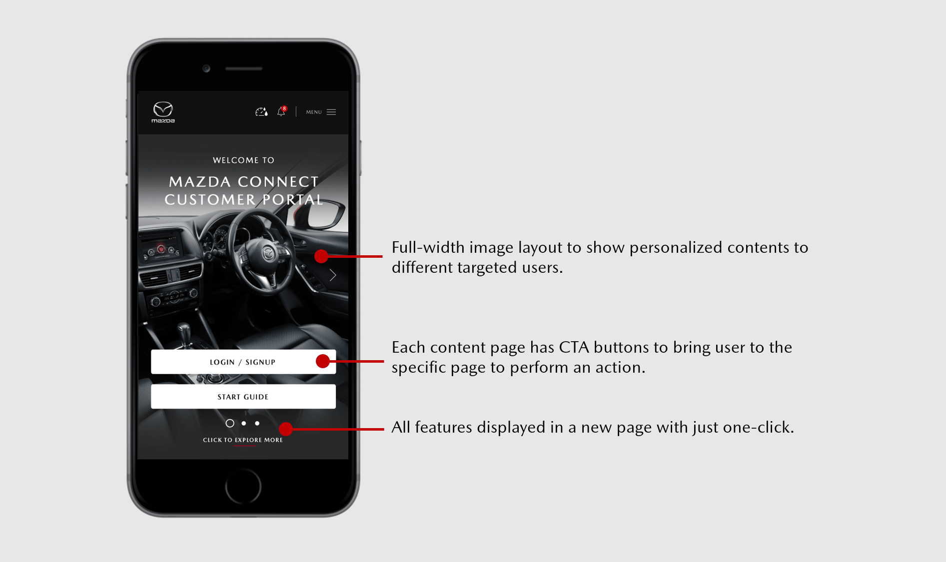
The version 1.0 layout cannot cater to additional features. A one-page display of all the available features is better for the user to view and navigate around. With the version 2.0 enhanced layout, users can easily navigate to search for the specific feature they want. e.g. click SERVICES to schedule a service appointment. In the long run, this interface is ideal to cater more additional features for both Sales (Explore) and Aftersales (Experience). To continue updating and managing content like the image slider and headline, we decided to enhance the CMS to be more flexible in adapting to the layout.
Concept of the main image sliders at portal Homepage
Sketches, Wireframe, Mockup & Prototype
Following an initial period of few months on research and wireframing, I proceed to come up with the low and high-fidelity mockups, followed by the prototype. I use Photoshop and Adobe XD for the mockups. For the prototype, I use Marvel App tool to test the interaction and navigation flow.


#1: Wireframe sketching #2: Motion effect interaction #3: Focus #4: Testing motion effect in Adobe XD #5: Test with multiple devices #6: Prototyping in Marvel App
Art Direction
Mazda has had an established visual identity for many years. Their previous CI was a dark theme until 2020, before switching to a white theme. This explains the reason Version 1.0 interface was using a greyish-black background. As part of the standardization guidelines across global countries, we stick to using the provided CI from Mazda Japan – color, font, typeface. To accommodate the simple, clean, minimalist style in Mazda CI, I’ve designed a set of customized icons for the key features.


Note: The illustration shown may subject to changes, should any design amendment be passed to a different team.
In the following stage after the wireframes & prototypes were finalized, a guideline deck was prepared and documented to be sent to the developers to refer to before proceeding with the actual development. The guideline (similar to a Styleguide) consists of typeface, font size, color code, theme & icons. Many stages of discussions were conducted with the developers to kick-start the development from the objective, concept, design, function, and down to the minor details. This documentation process required the most rework and time to maintain. We ensure the whole design system is standardized and aligned with the latest Mazda CI.


CI guideline preparation for developers before kick-off development.
03
Functionality – The Connectivity of the Portal
"How does a good user experience help to make the customer journey experience more fun and personalized?"
Customers can access both Sales and Aftersales functions in the portal. They can stay connected and engaged with the Sales and Aftersales operation key users. For example, book a service appointment at your nearest service centre or, book a test drive at your nearest showroom.
_LI.jpg)


It took me quite a while to study & understand the Sales & Aftersales operation in Mazda. With frequent visits to the showroom & service centre to discuss, interview, get feedback and suggestions from the key users, more features will continue to expand in the future.
Development Stage
Agile Approach, Testing & Deployment
As this is a complex & long-term project, we are working towards the “agile”, instead of the “waterfall” approach. There are many small launches along the way. The goal is not to get everything 100% right the first time, but to get something in front of the end-users as fast as possible. This way, the product can be tested consistently through user feedback. This approach helps to:
-
Save on cost & avoid big blunders at the end of product launch or deployment.
-
Small flaws like technical glitches, issues & bugs can be fixed easily.
-
Faster way to validate business opportunities & upcoming new enhancements.
In each development phase, we went through cycles of requirements, consensus & approvals from the operation process owners and management level, before deploying and rolling out the systems. I’ve found the agile approach offers a more structured & productive way of working things towards the right path.
Rapid prototyping is the most effective way to gain meaningful feedback and determine the next action.

Source: Usage UX and Digital Experience
Usability Testing and Deployment
We conducted many A/B testings before deploying small enhancements along the way. After the Mazda Connect Customer Portal version 1.0 was launched in Beta for the pilot test, we’ve surveyed 5 internal users (Mazda staff) to test out the portal (UI and UX).
Tasks given:
-
Login/sign-up to the portal, then add a vehicle
-
Schedule a service appointment
-
Browse the Model Lineup
Results received:
(4/5 user) – Has difficulty navigating to the Menu page to login/sign-up and add a vehicle
(5/5 user) – After some time navigating to the feature page, managed to schedule a service appointment
(5/5 user) – Managed to browse the Model Lineup and book a test drive
Based on the results, we found out that the navigation at the Homepage and Feature page had issues. To solve this, we need to refine the homepage to make it more simplified. We categorize the individual features into 2 main groups – Sales & Aftersales. In the upcoming phase, this interface is also ideal to cater to more additional features. This is where version 2.0 emerged.


User survey tasks from UXArmy
Launch, Outcome & Conclusion
Mazda Connect Customer Portal version1.0 was launched in Beta for a pilot test. I was assigned to conduct training to the internal operation users on the Mazda Connect Customer Portal.
With proper planning and execution, we facelifted the whole portal to Mazda Connect Customer Portal version 2.0 and was launched on Feb 2021, with new layouts & features. I am still involved in the continuous enhancements of this portal. We will continue to improve the portal through useful feedbacks from the users both internal and external.
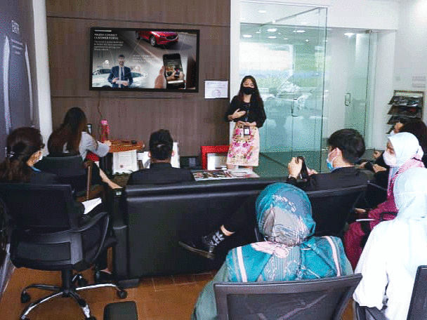
Training to internal operation key users
I am still involved in the continuous enhancements of this portal. We will continue to improve the portal through valuable feedback from both internal & external users.


Occasionally, I monitor the user's feedback in social media to gauge the product's performance, issues and continuously make further improvements if necessary. I was happy that customers expressed their satisfaction with the portal! Often, we received many positive feedbacks from everyone, on the convenience & seamless experience.
However, none of this could’ve been possible without such an awesome team and mentor. Although they were a small team, I was fortunate to work alongside talented people on this project. Cheers!
I’ve learned a lot throughout this whole customer experience design journey right from the start – not only in design but also in technical wise, logical thinking, communication, and project management. Being someone without a background in the automotive industry, I’ve gained many insights on the operation process level. There are so many possibilities and chances to improve with the help of technology to cater to the evolving demands of car buyers.
+80%
.png)
Usage rate increased to 30K-90K per month.
+50%
.png)
Growth in operation monthly revenue.
+70%
.png)
New users increased to 10K-60K per month.
- The End -
